 I subscribe to a very diverse collection of RSS feeds, most of them design and technology-related. Some of them are productivity-related, like Lifehacker, 43Folders and lifehack.org. But whatever the subject, if I see something interesting, I usually jump out of my reader and into my browser. I’m a designer, I love design, and I like to read blog posts within the context of the actual website.
So I recently read a post at lifehack.org. This blog often contains interesting content, but has never really attracted me visually. I finally gave some thought as to why.
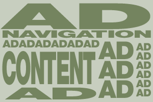
The post is about making money with one’s blog, which inevitably means advertising. But if you look at the page with the post, it’s filled with ads. I know, I know. Nothing new here. But this reminded me that visually, advertising is a problem on many sites. I respect the fact that some blog for money. When this is a goal, advertisers often come first, and they want prominent placement. Some ad services offer pre-styled links, banners, or multi-ad blocks. These are potential design problems, which I think can be solved with some design creativity.
One important principle is to distinguish advertising from actual content. Peppering a page with banners is irritating, and Google ads can often be mistaken for content, if that content is similarly styled. By creating a portion (or portions) of the page specifically for advertising, we won’t confuse or irritate users as much, and the ads become a deliberate part of the design, instead of the content becoming part of the advertising. Lifehacker does a pretty decent job of this. The content comes first, which means more readers. More readers means more attractive for advertisers. Another fantastic example is my good friend Brian Storm’s site MediaStorm, which is one of the most subtly designed blends of content, advertising and product marketing I’ve seen.
Also, don’t break the flow of your user interface with advertising. If you have ads at the top of your page (as a header, if you’ve sold your soul for petty cash), then your navigation, then another row of ads, and then a skinny row of content next to some more ads, I’ve got to hunt for your content and for your navigation. I can’t speak for all users, but if it irritates me, I’m gone– or I’m never coming out of my feed reader for that site again. Strategic ad placement is one thing, but strategic design will help both you and your advertisers make more money.