Designing in public, iteration 2
Today: A few design principles and some temporary readability interventions.
Some design principles to get started
There are a couple of design principles that I almost always apply, and I'll do my best to apply them to this project:
- Add only what's needed. This was the principle behind my former consultancy Zero Interface. The ideal UI is no UI: you think something and it's done. Stay as close to that ideal as possible. Designers talk about removing the unnecessary. I think it's better not to add it in the first place. Think in terms of additive sculpture.
- Design from the content out. What your content and functionality need, in addition to any other constraints you have, inform your design decisions. In a sense, they "tell" you what they need. But in order to hear them, you need to start with the content.
And I'm applying one more specifically for this project:
- No roadmap and no backlog: I have no plan. I have enough roadmaps and backlogs at work. With a personal project, there's no need. I'll be "listening" to the content as I mentioned above, but I also might be inspired by different sources along the way. We'll see. Refactoring is a part of the work.
What the content says: readability
Here's how the end result of iteration 1 looked:
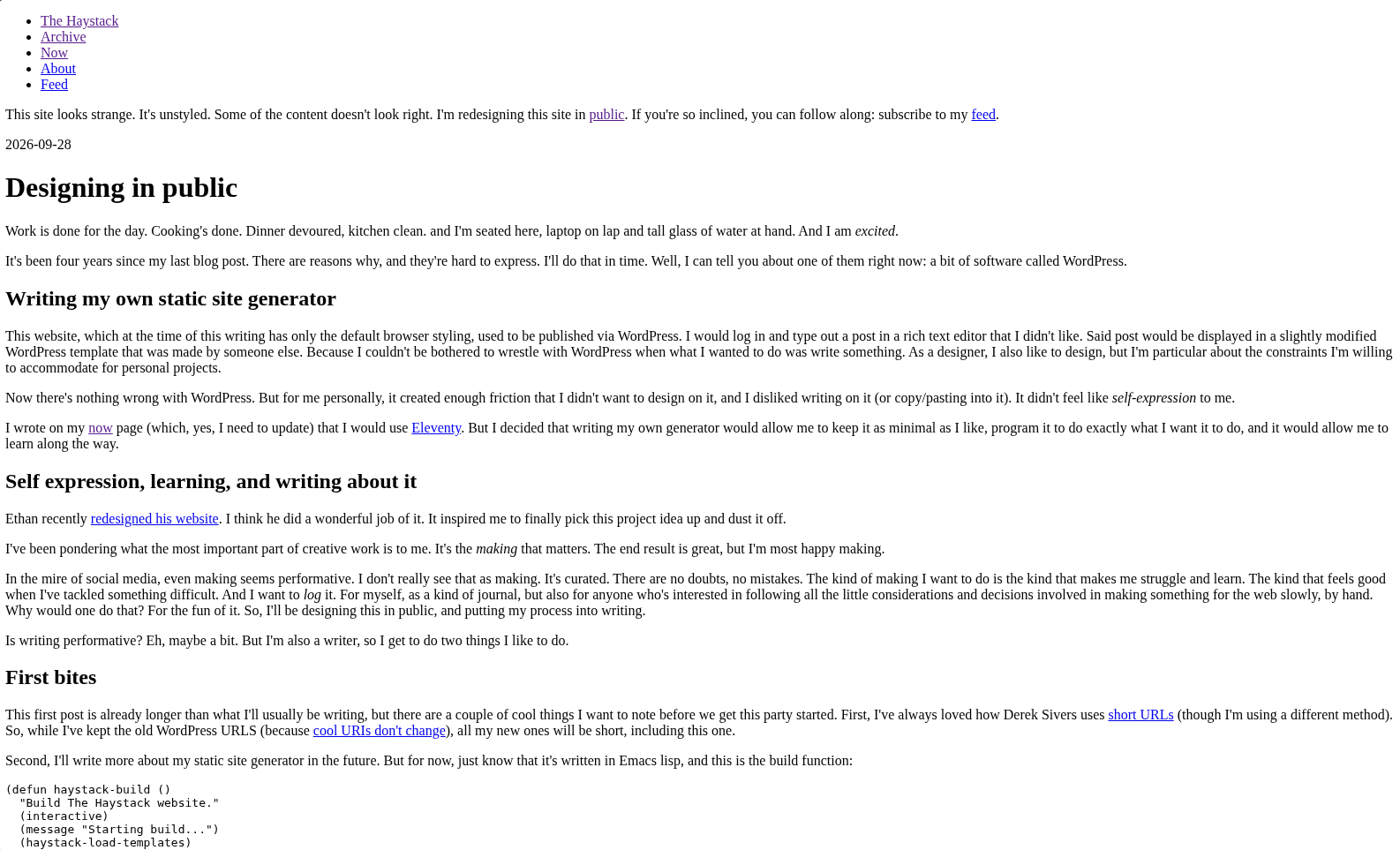
I'm writing about this process, so it must be readable now, even if I might make different decisions later. First thing is to change the font to a generic sans-serif (I don't like the default serifs much), and give ourselves a reasonable text column.
body {
    font-family: sans-serif;
    display: grid;
    grid-template:
        "h h h" auto
        ". c ." auto
        "f f f" auto / 1fr min(70ch, 100% - 4rem) 1fr;
    background: #faf7f3;
}

p { line-height: 1.4; }

body>div { grid-area: h; }
main { grid-area: c; }
footer { grid-area: f; }
I'm using CSS Grid here even on this simple layout intervention, because I know I'm going to use it later. I've set the main text column to 70 characters or the full width minus 4rem, whichever is smaller (for e.g. phones). I'm not worried about anything outside of the main content area yet. I also set the background to be not-quite-white. And finally, paragraphs are much easier to read with more spacious line-height.
Not pictured here: a couple of lines to remove the default margins on <figure>, and to give images a max-width of 100%;
Code blocks
Since I'll be showing code often, it will be easier to read with some syntax highlighting. A package for Emacs called htmlize takes care of adding classes to the HTML that correspond with the text decorations in my editor. As a bonus, it makes it possible for me to export the exact colors my editor's theme is using, so I get a decent result without having to think about it. I can change these colors later when I choose a more robust color palette. Running (org-html-htmlize-generate-css) from within Emacs provides me with all the CSS I need with the right colors. I can adjust these at any time. Here are a few, as an example:
.org-comment,
.org-comment-delimiter {
    color: #a0a0cf;
    font-style: italic;
}
.org-string {
    color: #f3a0a0;
}
.org-keyword,
.org-css-property {
    color: #deb07a;
    font-weight: bold;
}
This should make code more readable than it was. Just a handful of little interventions yield big improvements. I love finding and applying those; they add up over time.
Until iteration 3!