Web logo design 3.0
Remember the Swoosh
logos of Web 1.0? And the
shiny-drop-shadow-reflection-gradient-badge-icon
shit
we're still digesting today? Well, get ready for Network Graph logos
for Web 3.0. At least, that's my prediction. Assuming that Web 3.0
involves the emergence of practical
Semantic Web
applications, we can expect to see plenty of logos based on a
visualization of graphs depicting nodes within a network. Ehm, like
this:
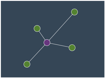 Don't underestimate the highly
creative use of the dot on the lowercase
letter i as a node within the network. Real cutting-edge designers
will possibly use the letter o. Oh, and for goodness' sake, use
orange and blue in the logo, okay? Dare to be
different. If you want to really turn Web 3.0 on it's head, join me in
designing square, tree-hierarchical logos for semantic web applications.
In Microsoft Word. No, make that Powerpoint. No, Paint. No, ASCII.
Just to keep these people on their toes.
Don't underestimate the highly
creative use of the dot on the lowercase
letter i as a node within the network. Real cutting-edge designers
will possibly use the letter o. Oh, and for goodness' sake, use
orange and blue in the logo, okay? Dare to be
different. If you want to really turn Web 3.0 on it's head, join me in
designing square, tree-hierarchical logos for semantic web applications.
In Microsoft Word. No, make that Powerpoint. No, Paint. No, ASCII.
Just to keep these people on their toes.
[On a serious note, I'm testing the Twine beta and find it an awesome concept. These types of apps will change how we as end users approach information. To their credit, they are also one of the first apps in this space to utilize the network-graph-logo-with-the-dot-on-the-i-as-a-network-node design meme.]
Comments
Niels Bom
Your second link with web2.0 logos also has a “new classic” with a node structure in it: http://www.socialtext.com/
Nice observation :)